Bhamwiki:Logo
Bhamwiki's logo was designed by User:Dystopos and has evolved gradually since the Project to Document the Birmingham District was launched in March 2006. The concept was to use bold lettering to fill a square area which has a geologic section of Red Mountain at its base. This indicates, conceptually, that the project is founded on the geology of the Birmingham District and that, like a geologist's structure section, it intends to reveal something about the structure of the region. The colors were chosen for their boldness and for the connection between "red" and Red Mountain (and to its emblematic use in the Flag of Birmingham).
Alpha logo
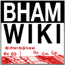
Debuting two days after the site was launched on March 15, 2006, this "alpha" logo appeared on the site until May 26, 2006.
The geologic section here was taken from the "Structure Sections" map in United States Geological Survey's "Birmingham Folio", No. 175 in the Geologic Atlas of the United States (1910). It shows a section of Red Mountain in northwestBirmingham through the Huffman area.
The font used was Impact, designed by Geoffrey Lee in 1965. The "M" glyph was replaced with an upside-down "W" to help tie the two lines together. It is published by the Monotype Corporation and distributed by Microsoft as one of their "core fonts for the web".
Second logo
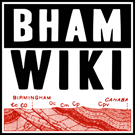
This logo appeared for just over two years, from May 26, 2006 to June 13, 2008. It features a much more legible geologic section, cropped down just to Jones Valley and Red Mountain in Birmingham. The image is part of Structure Section C inset into the Geologic Map of Alabama prepared by the Alabama Geological Survey in cooperation with the United States Geological Survey and published as an insert in Geology of Alabama, Special Report No. 14. (1926). This section runs closer to downtown, through the portion of Red Mountain being developed as Red Mountain Park.
The font used is News Gothic, designed by Morris Fuller Benton in 1908 and available from numerous font bureaus. Inverting the text in the upper portion of the logo helped to balance the logo and reinforce its square design.
Current logo
The current logo debuted on the site on June 13, 2008. Refinements include using more context in the geologic section (from western Birmingham to the Cahaba River north of Acton). The formations indicated by the small symbols shown in this portion of the structure section are as follows (left to right): Conasauga ("Coosa") formation, Cambrian or Ordovician dolomite, [Birmingham], Chickamauga limestone, Parkwood formation, Pottsville formation, [Cahaba River].
A larger version for print media is here.
The font used is "HeadlineHPLHS-One", designed by Andrew Leman in 2002 based on vintage copies of the Toronto Star newspaper. It is available as part of the H. P. Lovecraft Historical Society's "Free Font Pack" at cthululives.org [1].
Merchandise
The Bhamwiki logo is now in use, emblazoning a few items of apparel and other knickknacks at Zazzle.com/dystopos.
A portion of net sales goes toward the maintenance and improvement of Bhamwiki.


