UAB logo: Difference between revisions
(Created page with "right|300px The '''UAB logo''' is a monogram used to represent UAB, identifiable by its thick block letters and slanting "A". It is not known who de...") |
No edit summary |
||
| Line 1: | Line 1: | ||
[[File:UAB | [[File:UAB monogram.png|right|375px]] | ||
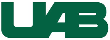
The '''UAB logo''' is a monogram used to represent [[UAB]], identifiable by its thick block letters and slanting "A". | The '''UAB logo''' is a monogram used to represent [[UAB]], identifiable by its thick block letters and slanting "A". | ||
Revision as of 15:44, 11 March 2016
The UAB logo is a monogram used to represent UAB, identifiable by its thick block letters and slanting "A".
It is not known who designed the logo. It appeared in some university stationery as early as 1975, but its use was inconsistent until the mid-1980s. By 1988 it had become nearly ubiquitous on all publications and signage.
Until the mid-1970s UAB had an in-house graphics department headed by Jack Wills which operated under the Media and University Relations office, but many specific publications and other graphic materials were produced by outside vendors. In 1975 the advertising firm of Basinger & Sankey was commissioned to create a university-wide "graphics identity program". They completed a preliminary report, but withdrew from the contract during the process of making revisions. It is unknown if UAB adopted any or all of their recommendations, and no copy of the preliminary report is held at UAB Archives.
Use of the UAB logo is subject to the guidelines and practices adopted by the UAB Office of Public Relations and Marketing. It is generally rendered in Forest Green (Pantone Matching System 3425) and usually accompanied by a wordmark (The University of Alabama at Birmingham) and tagline (Knowledge that will change your world).
See also
References
- Communication from Tim L. Pennycuff, University Archivist (March 11, 2016)
External links
- Logo Use at uab.edu/brand
